A website navigation mistake
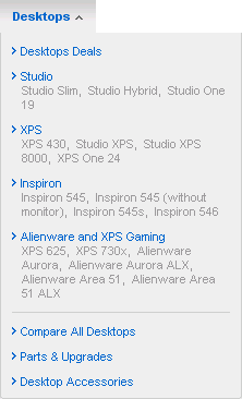
Wednesday, October 21st, 2009I’m currently thinking about buying a new computer and came across Dell’s website. Here’s the menu that they presented to me to choose from:

Don’t know about you, but I was completely lost here. Would I want a Studio or and XPS computer? No idea. Probably the folks at Dell know their products too well and sometimes forget how it must look like for their (first-time) customers.
I left Dell’s website (without bothering to ‘learn’ what they mean) and revisited my own site to see if I did it any better. And was surprised to see that I made the same mistake (a bit) with the product names.
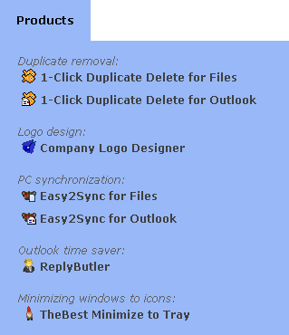
Some of my product names (like 1-Click Duplicate Delete for Outlook) are pretty clear. Others (like ReplyButler) can leave you guessing. A customer might be interested in it, but only if I make it easy for him to understand what the product is for.
So here’s the way I found to make it clearer:

It’s still very brief, but at least tells you enough about it to decide whether you might be interested or not.